Call Us: +971509256911 Email: info@cbox-dubai.com
Call Us: +971509256911 Email: info@cbox-dubai.com
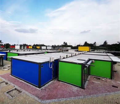
Jakarta, Indonesia Container City by Samanea, Lesso
Project: Samanea Container City
Location: Tangerang, Jakarta, Indonesia
Total Plot Area: 96,868sqm
Allocated Site Area: 26,509sqm
Total No. of Containers: 450
The Timeframe of 3s.
3 Hours - Sort out and resolve clearance during ‘red light’ period.
3 Days - Complete and finalise architectural drawings and models.
3 Months - Complete construction of the development.
3 Languages - Chinese, English, Bahasa.
3 Concepts - Debated over 3 different ideas within 3 days.
What is Modular Architecture ? We commonly know it as ‘the repetitive building blocks’ in terms of infrastructure development. However, specifically in design and development its focus is to simplify and elevate the architectural system at the same time maintaining its creative value in its spectrum of puzzle-works, ‘connect-the-dots’ in relation to its planning and coexistence of spatial planning. Its beauty, the ability to allow one to replace or add a particular component to the bigger picture without risking the fact that it will affect majority of the system as compared to what we normally see in integrated architecture. In short, every component plays a part as a system it self as well as in a much larger scale of a ‘illustration’ in architecture. This way, its independent structural characteristics allows for greater flexibility, efficiency and convenience in the world of architectural development.
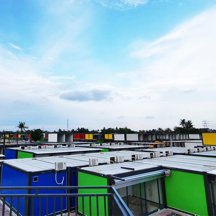
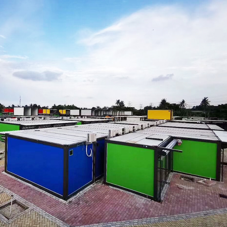
The container town is located in Tangerang, Indonesia. The project is all transformed from flat pack container house and detachable ccontainer house into a container creative town. All the containers are made of light steel structure to improve the service life. Middle-layer sandwich panel to minimize noise. The total area is about 3,000 square meters and can accommodate 100 stores, 488 flat pack container. At present, the average daily passenger flow is about 10,000+.
‘The Project’, is part of the TNIC Tangerang Industrial Development. Once a village rich in paddy fields, plantations as well as Indonesian culture is now an up-and-coming American influenced private redevelopment next to the highway accommodating to the upper spectrum of living standards. The main focus of the company’s investment was to create what we call ‘a city within a city’, catering to a group of specific users quality lifestyle, highlighting its exclusiveness that of its purpose. The plot is surrounded with hectares of greenery, natural buffer zones from that of the busy highway, forming a tranquil estate-like environment for users. This way, apart from its luxurious ambience, the enclosed environment has also contributed greatly to its market value. Hence, the best way to boost and compliment this economic factor is to invest in exquisite large scale amenities and infrastructure such as shopping malls, hotels and private bungalows.
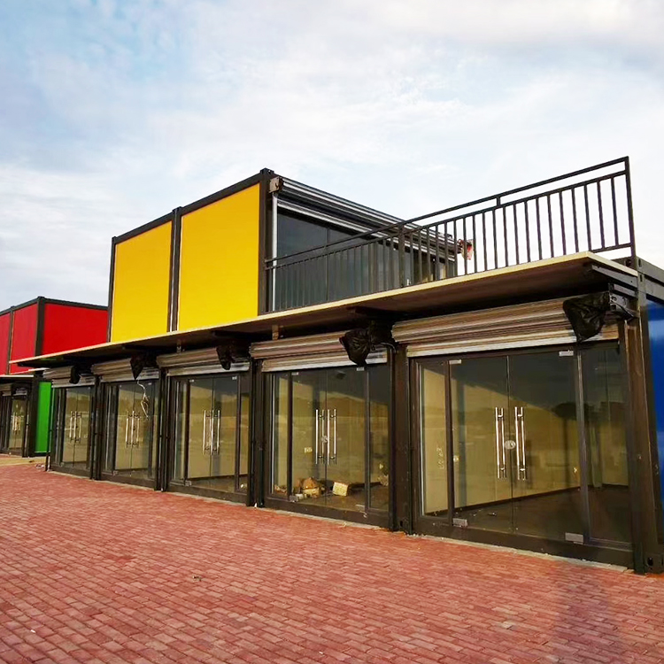
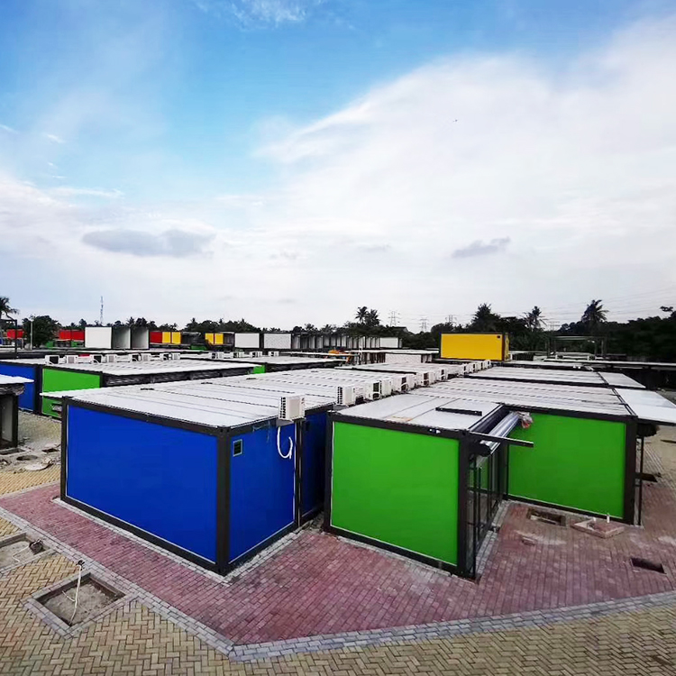
As such, the choice of a commercial development, ‘Samanea Container City’. One, it not only is an ideal way of attracting more residence and buyers but also acts as a node, a contrasting development of infrastructure from that of the usual architecture as observed in the vicinity. The Master plan is based of the concept of our street & night markets, a gateway to another city. Which leads us to the decision to start of with a composition of interlocking shipping containers as the beginning an exclusive experience. Also to spice things up with a little fun factor physically, 4 colours, traffic red, traffic yellow, traffic green and sky blue were specifically selected in commemoration of the traditional festival colours seen worn on the locals. highlighting the atmosphere, uplifting the ambience of the entire project in respect of the Indonesian culture.
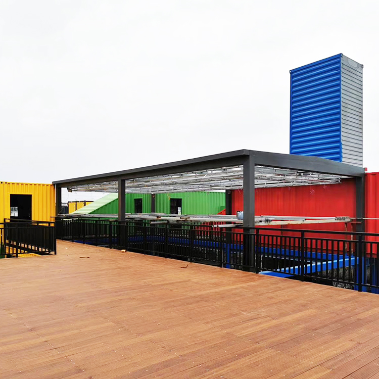
The Reception & Business Centre with an area of approximately 550sqm, using up to 20 shipping containers and the mix of steel structure, was inspired by an illustration of two hands, fingers interlocking, representing the cooperation of companies and countries between China and Indonesia, at the same time maintaining an illusion of infinity spatial relationship, vertically and horizontally pronounced by the vertical movement of diagonal containers between levels. In addition, to balance out the overall dimensional elevation, the components were oriented to spiral around a void space. This way, it not only achieves it dimensional beauty but also allows users to get a 360 view of its surroundings building up on its spatial relationship with the surroundings. The void space was then decided to be design as a double volume hall space based of the idea of a simple transparent element slightly taller than that of the multi-coloured ‘steel blocks’. Creating contrasting transparency between the components, the main hall is constructed mainly out of simple steel structure and double glazed tempered glass which not only maintain the essence that of the containers at the same time complimenting the overall vertical depth and ratio of the infrastructure due to its spatial proportion in height and width. To sign it off, a shipping container tower was incorporated, standing at 12 meters with the project’s signature in acrylic, elevating the site’s nodal aspect. Magnifying into the details, the interior furnishings mainly consists of marble flooring on the first floor, parquet on the second, bamboo fiber composite panels for the walls and aluminum profiles for the corners and edges. In addition, preserving some aspects of the original rustic style of steel works by showcasing the corrugated steel sheet oh the ceiling in certain spaces as well as furniture. With the mix of style and materials, it overall portrays a luxurious yet rustic aspect of architecture style. Keeping in mind the exterior structure and concept of the project when users enter the development.
Leading on, the Shopping Street & Market, extends off the Reception & Business centre, with an area of approximately 26,000sqm, consisting of up to 430 flat pack containers. Conceptualizing on the idea of a limitless shopping experience, the Street begins by tracing along the road side in rows of two from the Tower to the opposite side of the plot welcomed by a massive street market. With refereence, one can say the journey through the development is like reading a book, begining grand with the unqiueness of the Reception & Business Centre being its introduction & plot, by the stretch of shopping street as its build up to its peak and finally ending of at the street market which portrays as the story’s climax & conclusion. In addition, containers are carefully incorporated in a staggering interval manner forming a representation of the Great wall of China, like that of a castle wall. Hence, not only does it allow surrounding or futre surrounding developments to have a glimpse of visual relationship into its communal open space but at the same time maintaining a certain amount of privacy as well as enhancing and maintaining its vertical elevation and proportion respectively. Resulting from such layout, open space are then unintentionally formed with the purpose to accomodate public activities and events, encouraging intereaction between sellers and buyers boosting its economic market value. Similarly, the shopping street market follows after the concept that of the shopping street, highlighting along the plot’s outermost setback with the ‘castle wall’ together with the repetition of shopping streets within, leaving the irregular corners as its communal open space. Unkowningly, such orientation and spatial planning started to form a ‘Maze’, unintentionally having customers ‘lost’ with the purpose for buyers to reconsider on their hesitation in purchasing as they linger. In addition, in order to increase the number of customers and users to ‘hangout’, the units on the second floor is desgined to have its own outdoor deck, serving the purpose of a cafe or a little eatery of sorts. Keeping that in mind, by incorporating Food & Beverages into the development not only will it encourage more users to come forth but at the same time customers would have a common space to hangout and linger during their journey within. As the saying goes it is food that warm the hearts and bring people together.

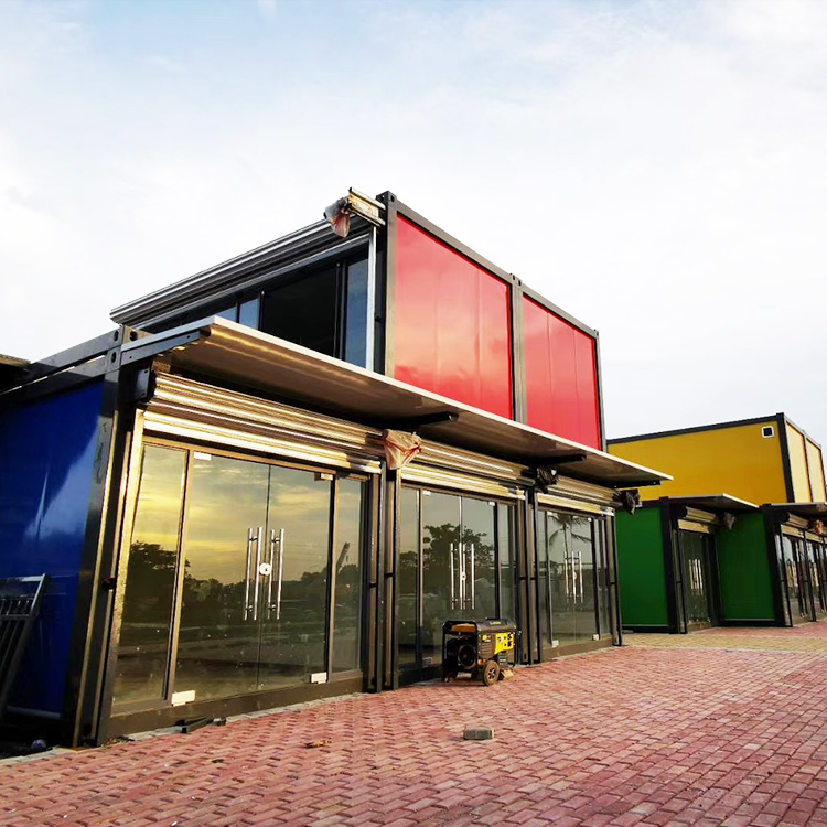
Why Flat Pack containers ? Due to the fact that the client wanted flexible layouts and the possibility to extend or enlarge certain shops, the Flat Pack container was considered the most ideal choice that would suit the criterea. This is so because the components that form a flat pack container are usually only bolted and sealed which allows for easy replacement or disassembly. As for the materials used, we went for a full height glass front elevation. This is so such that we can maximize advertorial purposes as well as visual interaction with the streets. However, in order to fulfill its security needs, a steel door shutter is also installed for every unit. Lastly, the choice of colours is also maintained throughout the development, similar to that of the Reception & Business Centre, maintaining the overall relationship of the development.
